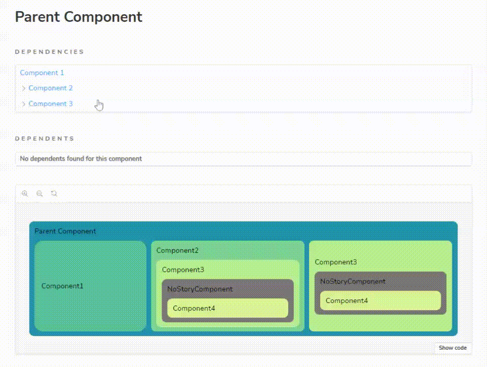
Component dependency tree
Browse across stories with an interactive dependency tree on autodocs page.
Storybook Addon Dependencies
This addon adds interactive dependencies trees to the autodocs page.
Getting started
This addon supports v7 and v8.
To use it with storybook 7 install npm i -D storybook-addon-dependencies@7.0.0
- Install
npm i -D storybook-addon-dependencies
yarn add -D storybook-addon-dependencies
- Register the addon in main.js
export default {
  addons: ["storybook-addon-dependencies"],
};
-
Build the dependency tree
-
Run storybook
Development scripts
To build the dependency tree of storied components run:
npx storybook-addon-dependencies
Blocks
This addon overrides the default docs page, if there is a custom docs page use this custom doc blocks in your template.
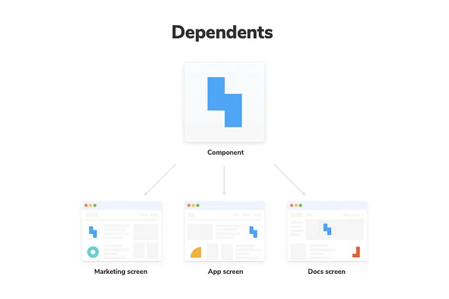
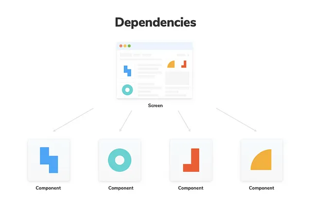
import { Dependencies, Dependents } from "storybook-addon-dependencies/blocks";
Hooks
To create your own tree design with custom doc blocks, get the current story title with the hook and the titles tree with the api.
import { useCurrentStoryTitle } from "storybook-addon-dependencies/hooks";
API
import { getTree, getDependenciesTree, getDependentsTree } from "storybook-addon-dependencies/api";
Warnings
- Don't write storied components in the same file. This may cause conflicts with the tree builder.
